“The Medieval Feathers Tarot” by Alejandro R. Rozán and Jay R. Rivera, edited by Blue Angel Publishing, is one of those rare gems one stumbles upon by happy accident—bringing a certain je-ne-sais-quoi of class and elegance to a world too often portrayed as dusty: the medieval universe. Here, the Tarot is reimagined through the symbolic and figurative lens of the feather, with the intelligent design of sumptuous cards and a thoughtfully written booklet which—though lacking more concise summaries and sample readings—still fulfills its purpose effectively.
- Concept 90%
- Box quality 80%
- Booklet quality 100%
- Booklet content 80%
- Card quality 80%
- Ease of handling 70%
- Ease of application 70%
💡 THE CONCEPT
The concept proves to be both original and poetic. Combining the art of featherwork with medieval ornamentation, while showing deep respect for the origins of the Tarot and its primordial iconographies, was a bold challenge that could have easily tipped into excess or obsolescence. However, the result is highly accomplished. Always passionate about the graphic style of Italian princely tarots, I am delighted to see that the talent of the artist Alejandro R. Rozán has managed to breathe new freshness into this universe while preserving the codes that made these early decks the “greatest” that history has bequeathed to us.
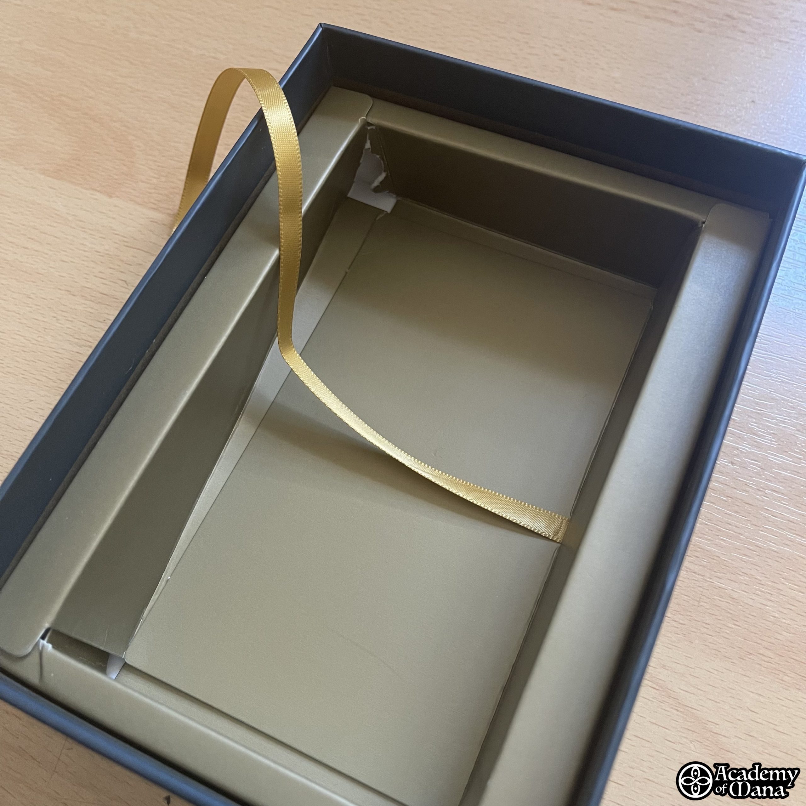
📦 THE BOX
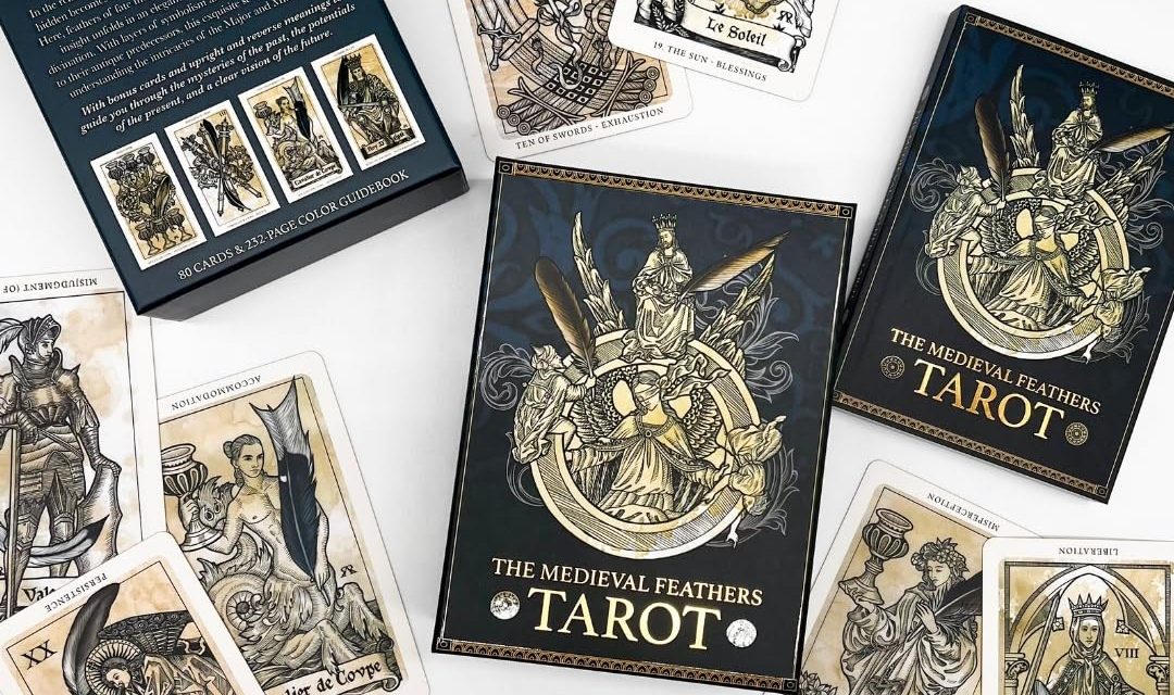
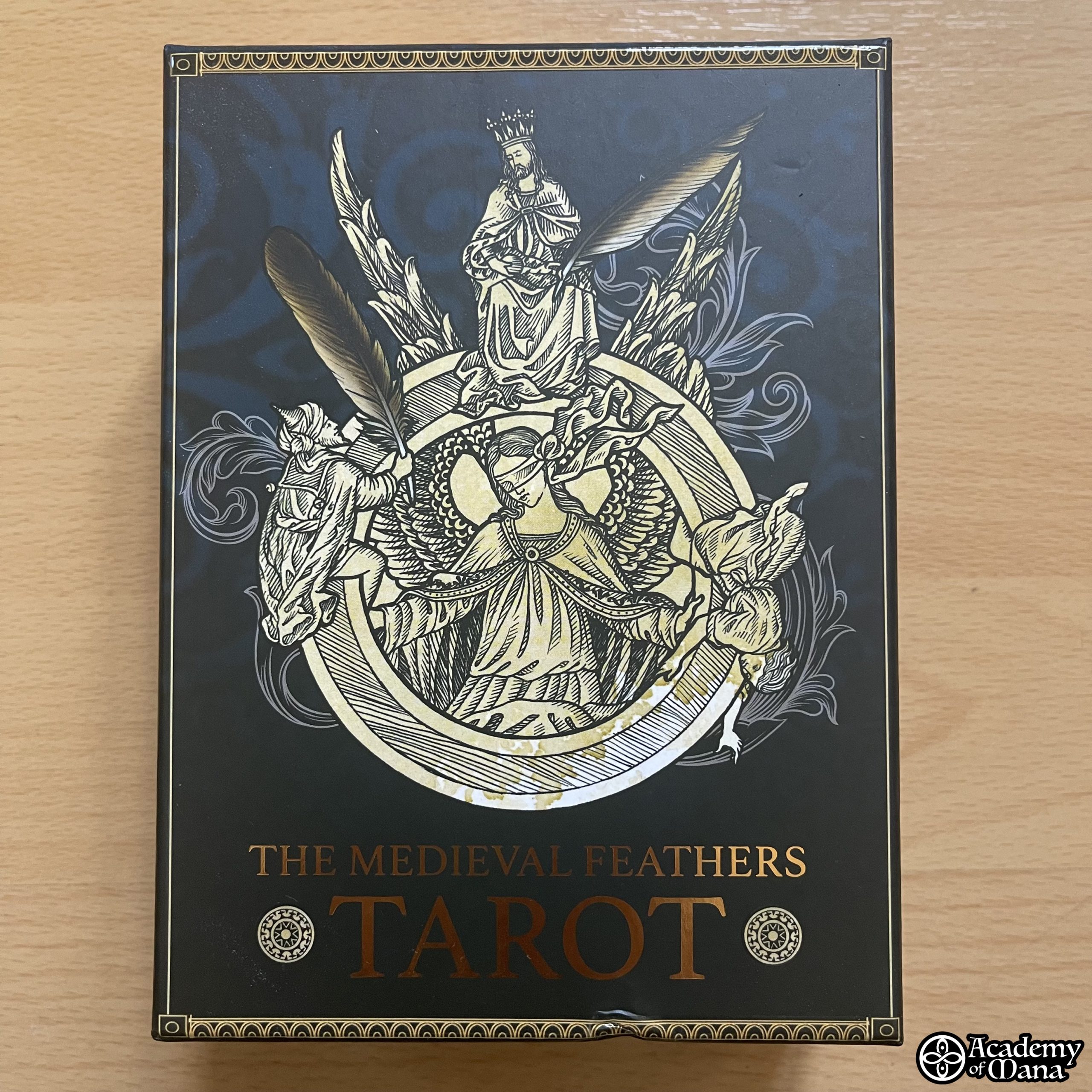
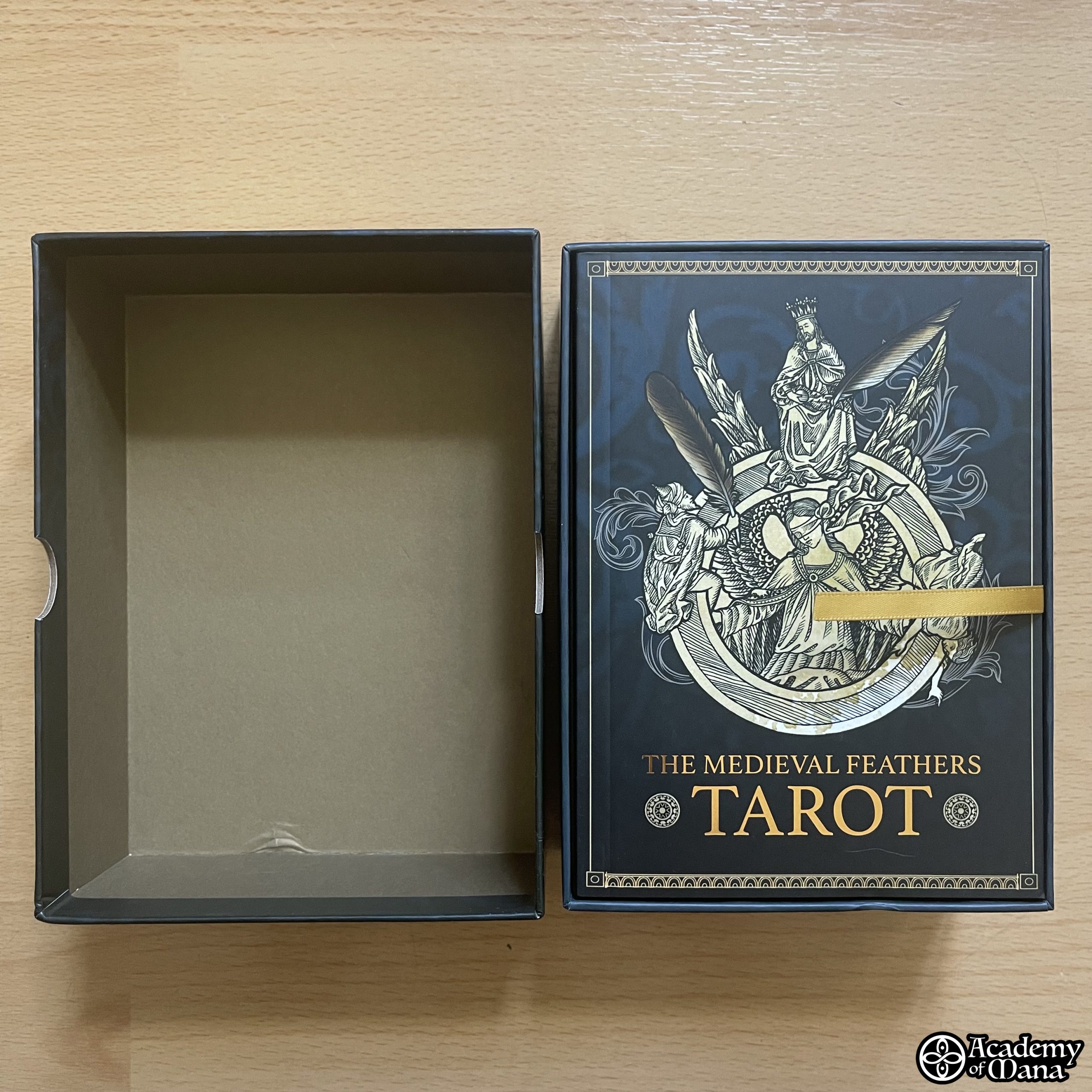
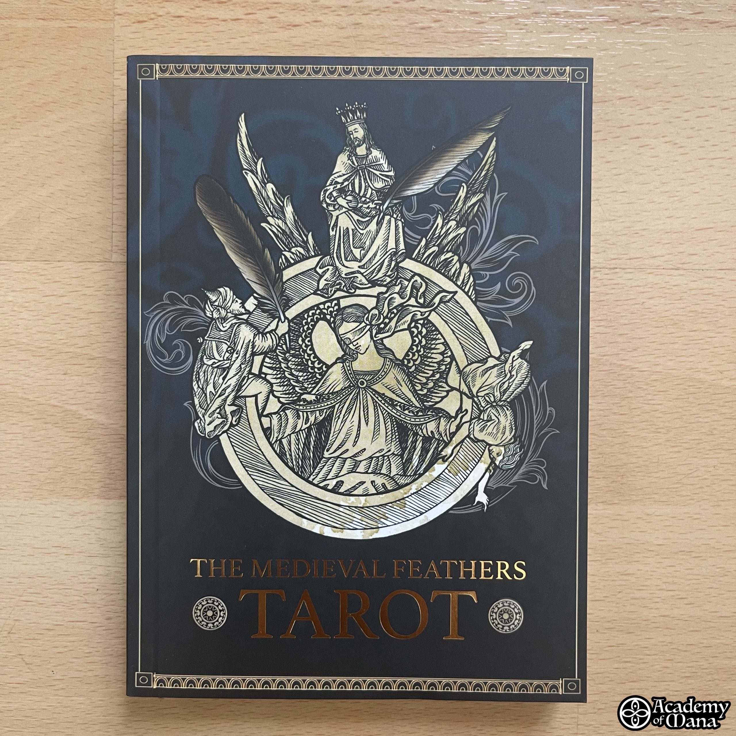
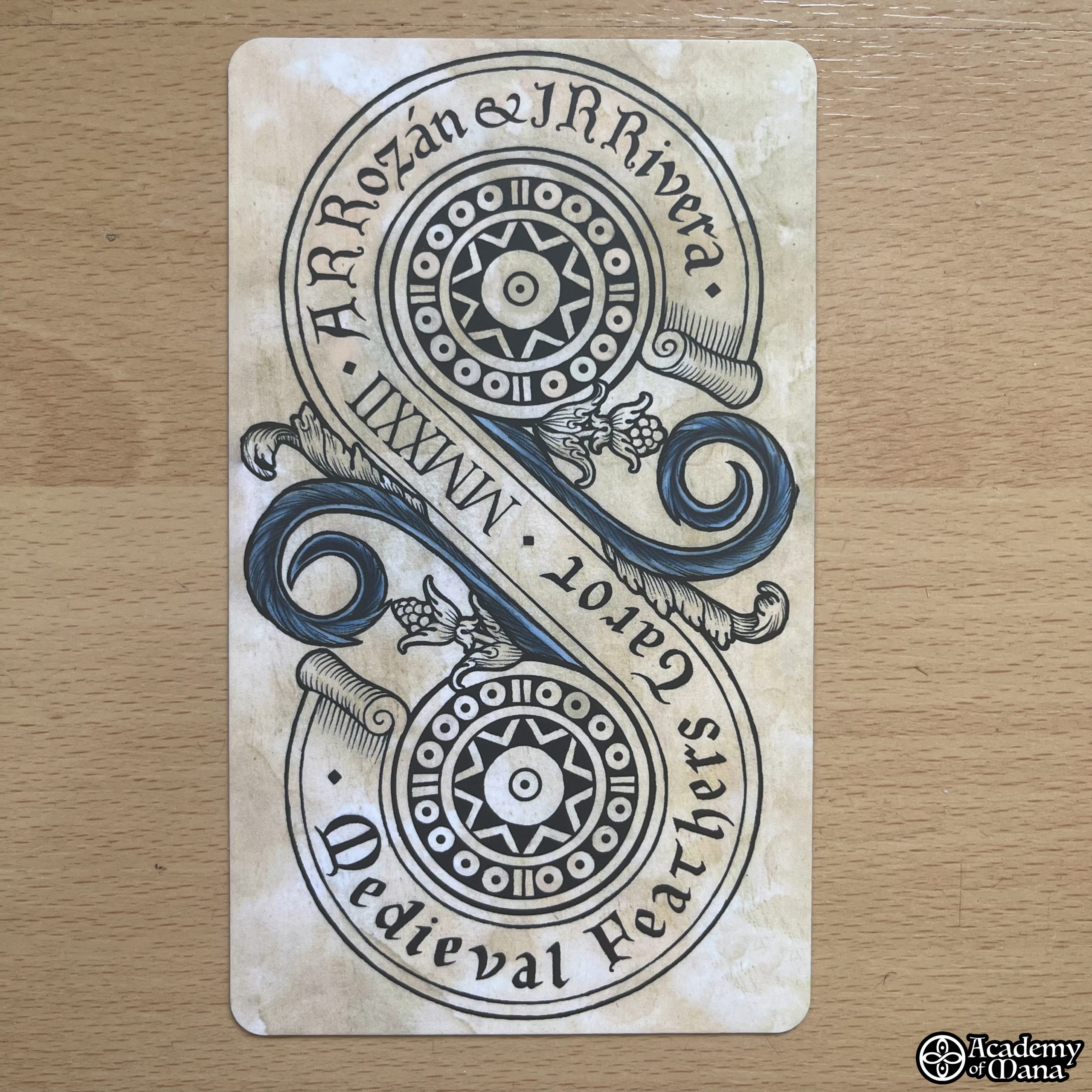
The packaging consists of a sturdy two-part box which, in my case, was unfortunately damaged on the outside (a small dent on the lower edge) and on the inside (slightly torn casing). Fortunately, thanks to its sturdiness, the box protects its contents very well, although it’s clear that due to its large size, carrying it around in your bag when leaving home is quickly not an option. You’ll need to resort to a pouch suitable for the (large) size of the cards. I particularly appreciated the attention given to the illustration on the front of the box, with this fourth color (gilding) on the title that looks very impressive.
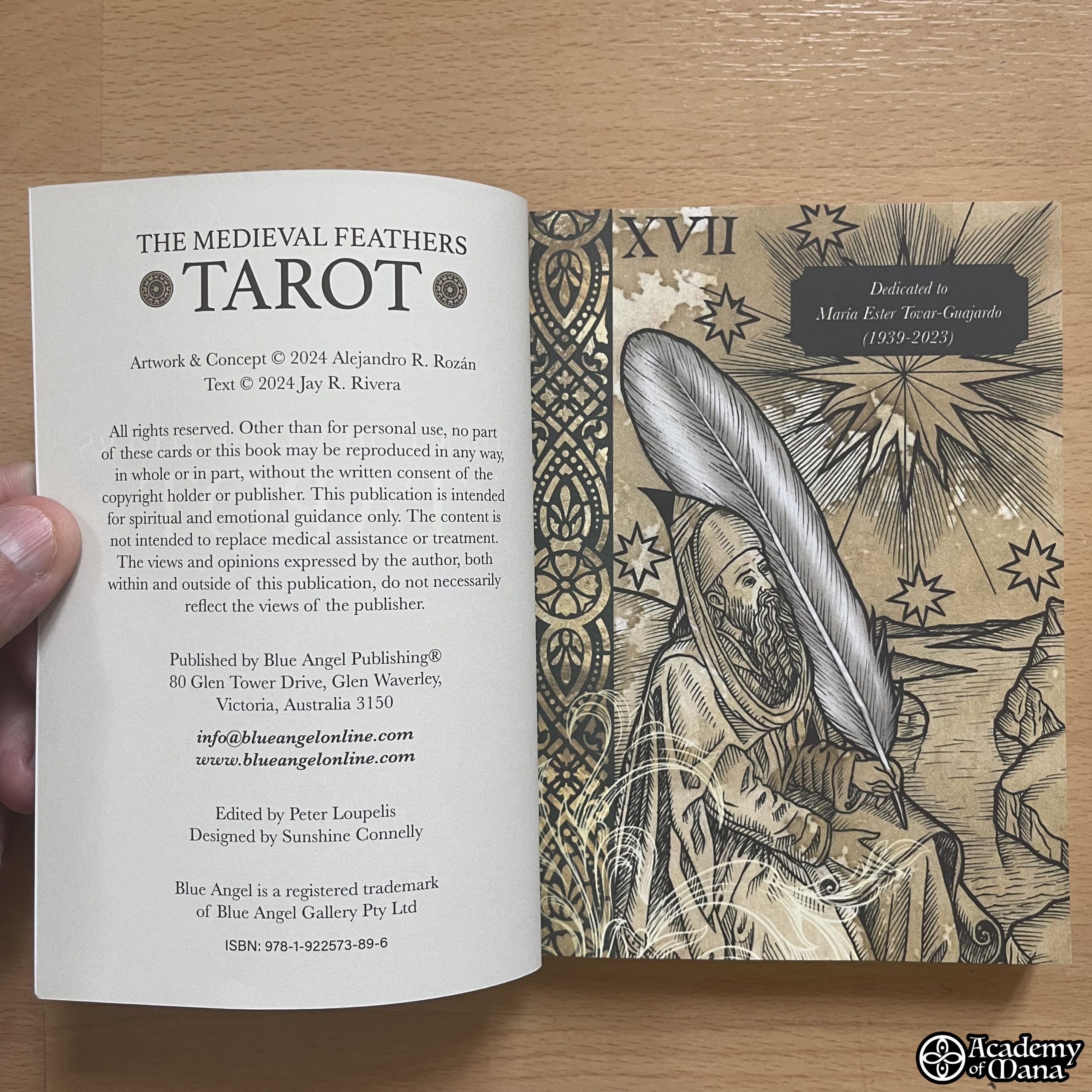
📖 THE BOOKLET
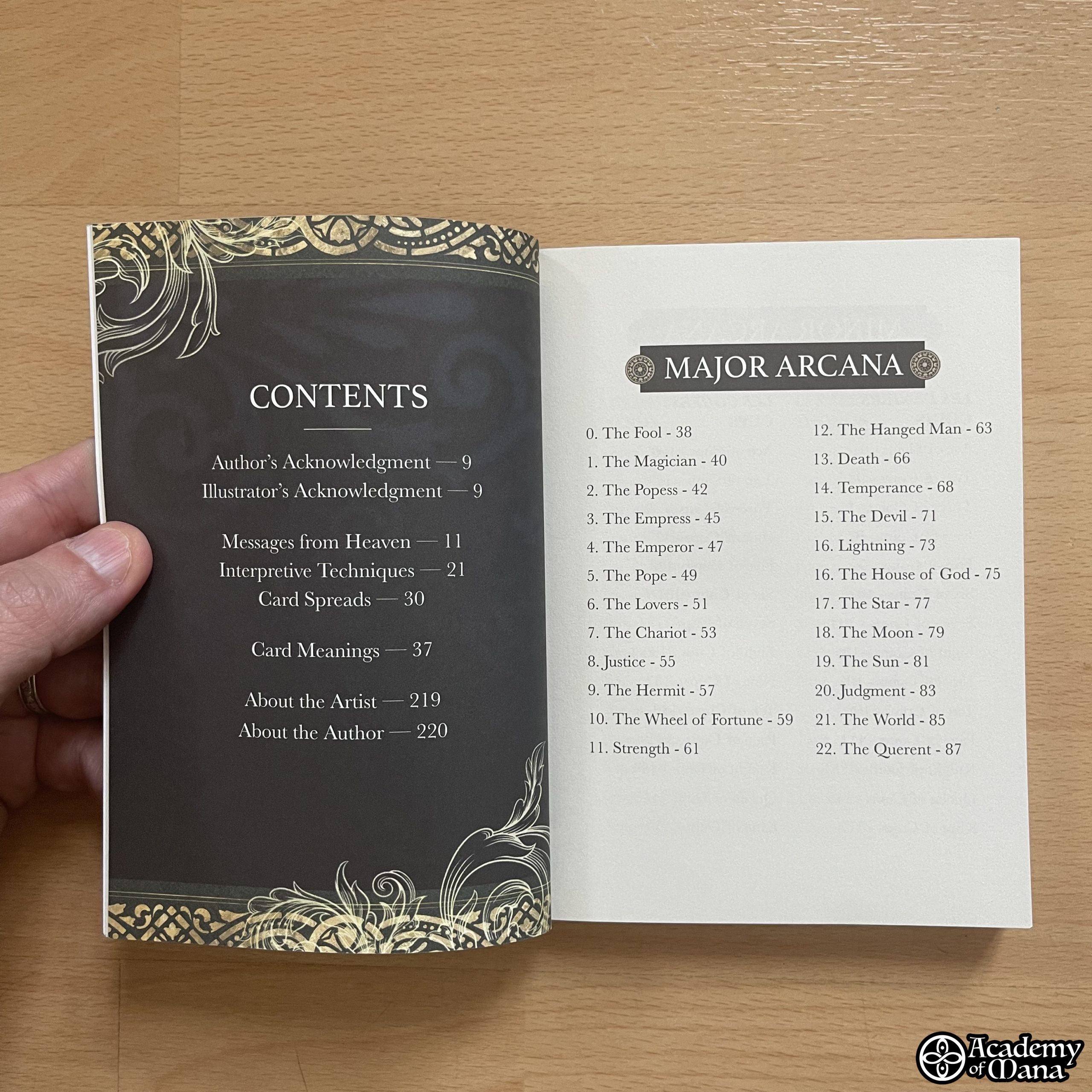
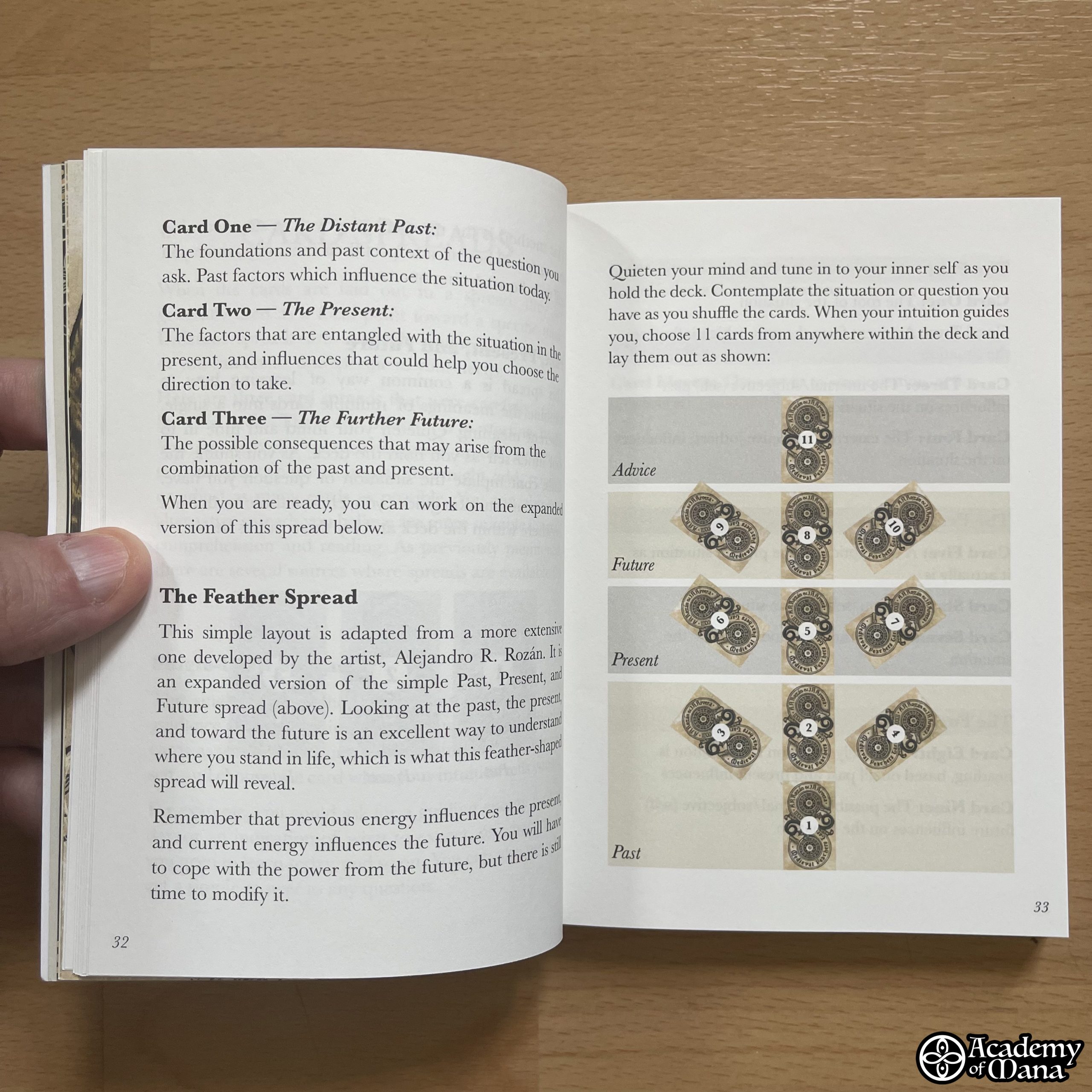
The booklet is undoubtedly the point on which I could be most critical. Aside from its highly appreciated explanations regarding the basic idea and the creative process that led to the creation of this game, citing the games the author used as sources of inspiration, it then presents 3 spread layouts followed by the description of the cards. And this is where I react.
Regarding the spreads, there are “types” of spreads… but no interpretations, no reading examples. This is a shortcoming I notice in many games, giving the impression that the author doesn’t want to commit, or perhaps doesn’t even know how to interpret the game they created. This is an issue for me, and I would have liked to find interpretation examples in this booklet for the different proposed spreads so that the reader can understand how the language of the game in question is structured.
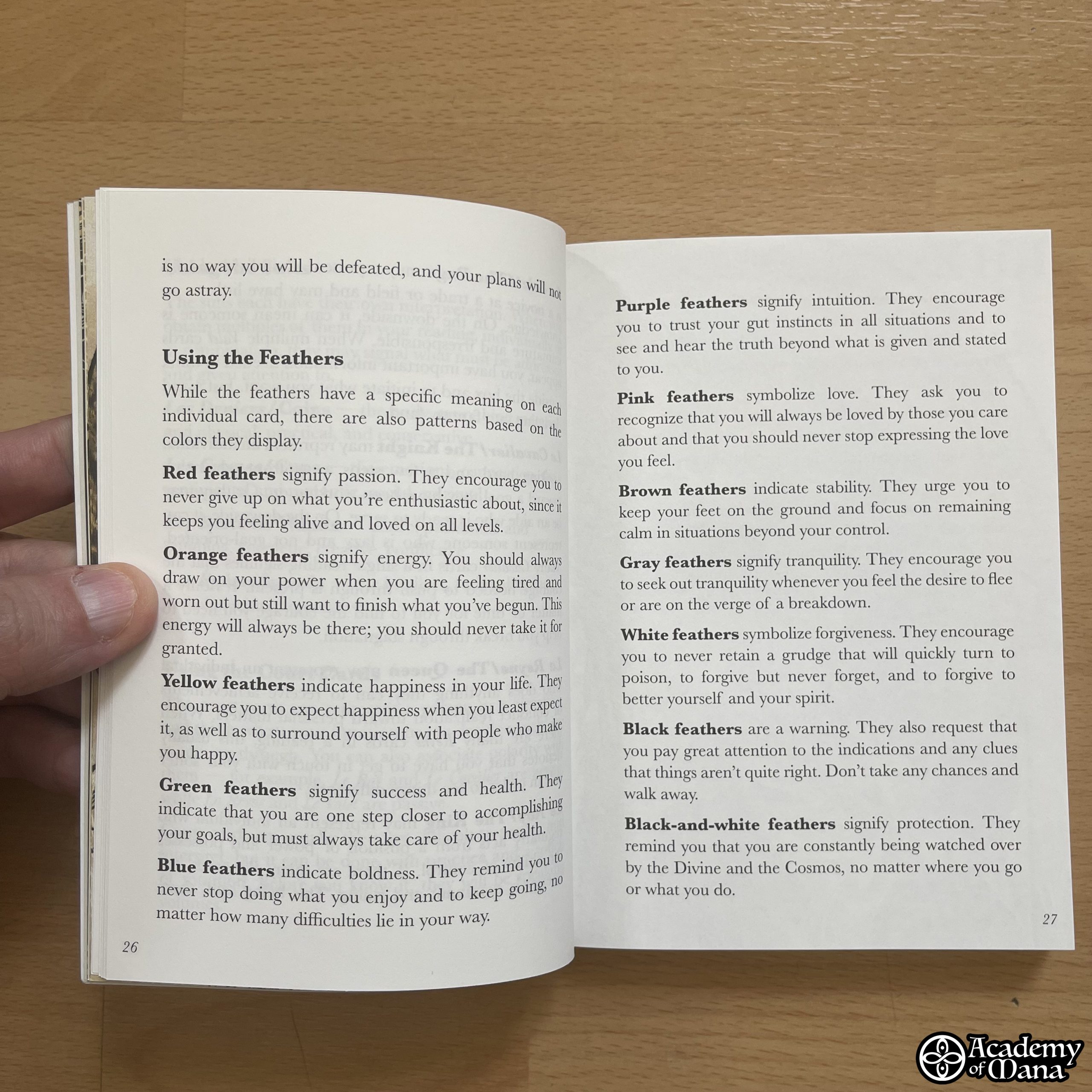
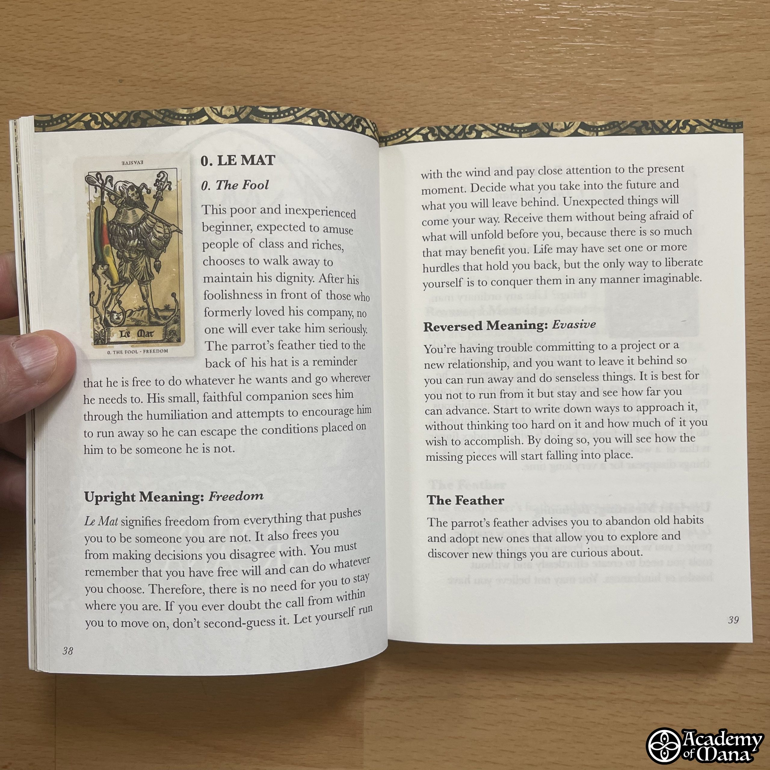
Another point I can raise concerns the descriptive text of the cards. I loved the explanations given for the feathers of each card. It’s original and very relevant. The interpretations are also effective. However, each card probably lacks a small list of keywords to quickly grasp the meanings of the drawn cards. When writing a game booklet, one should put themselves in the practitioner’s shoes, who shouldn’t have to reread the entire descriptive paragraph of each card every time. A small list of keywords allows one to capture the essence at a glance, making its use more practical.
On the other hand, I appreciated the textual and graphic quality of the booklet, as well as its design.
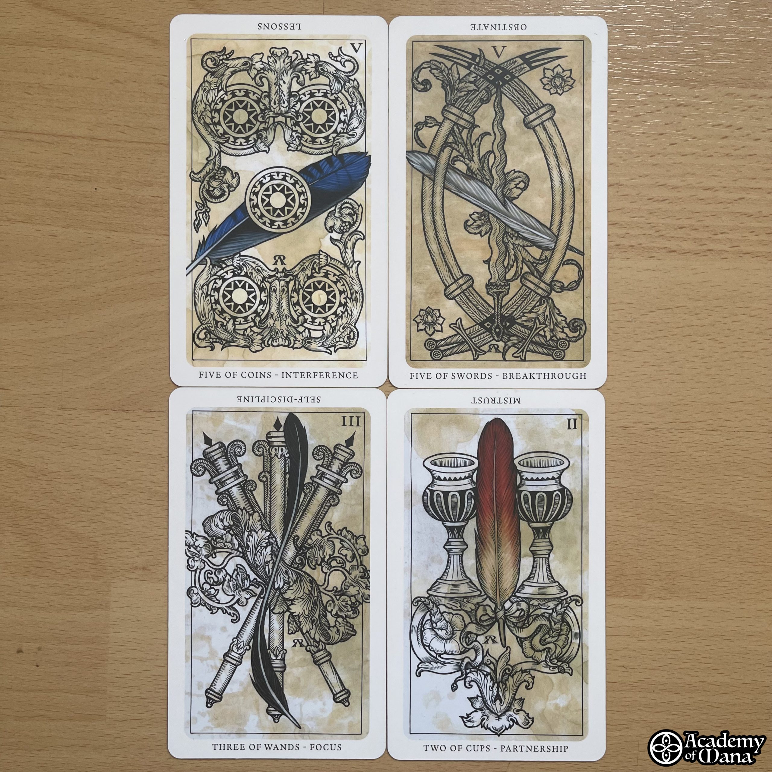
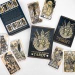
🃏 THE CARDS
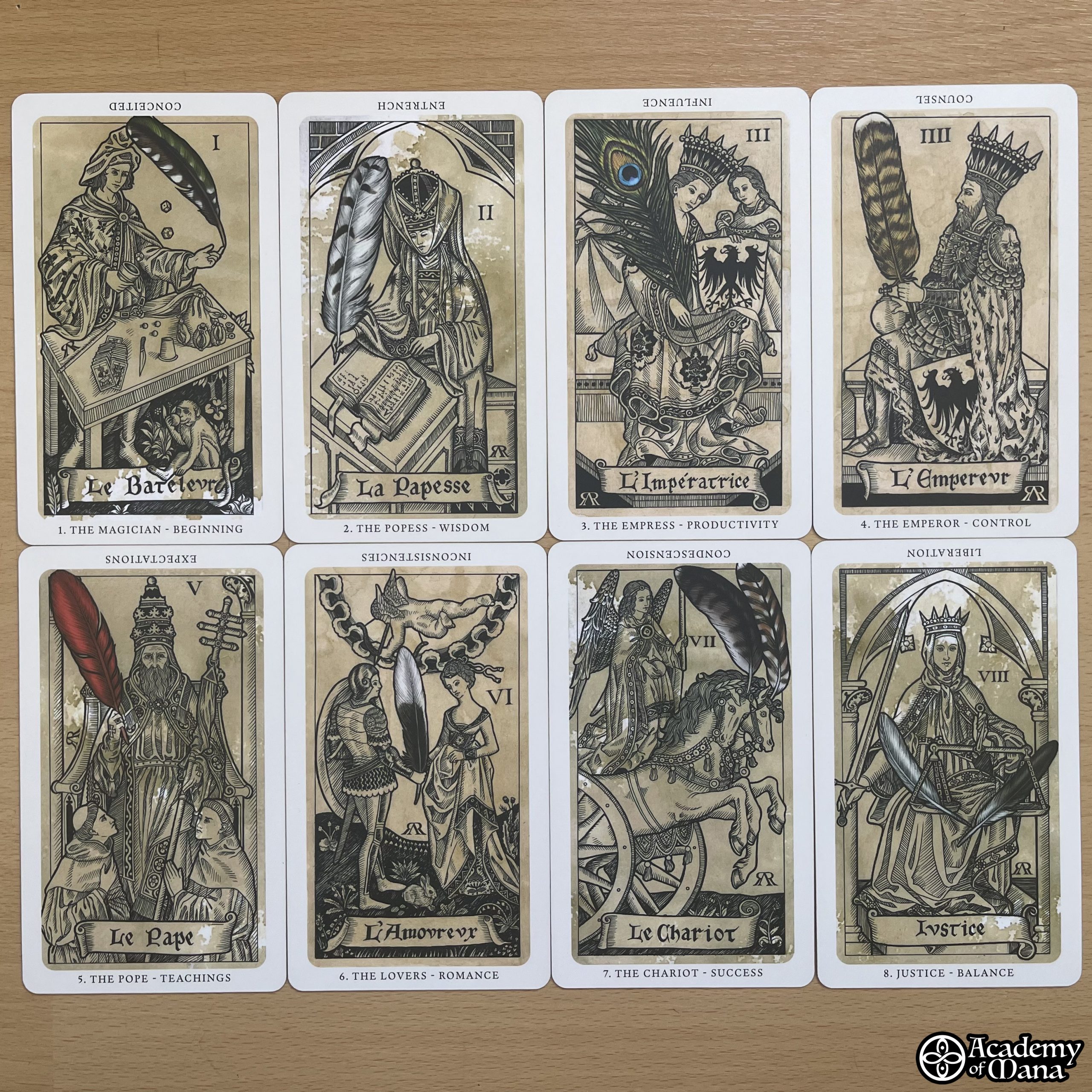
Regarding the cards, I can only praise the quality of the printing and the design. It is a true work of art that stands strong against most competition, and the matte gilding on the edges is absolutely stunning. Kudos to the artist!
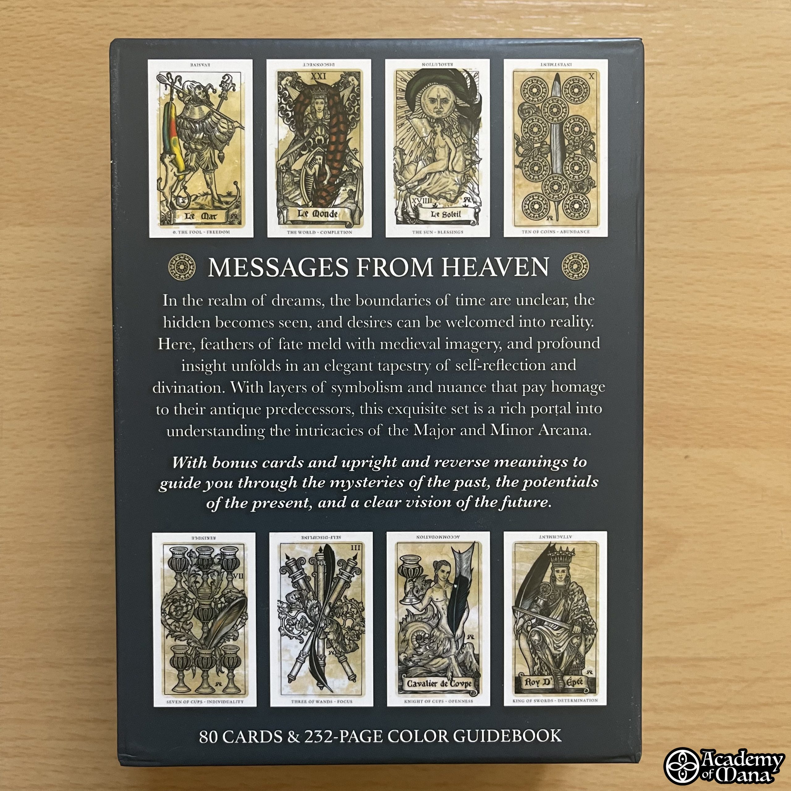
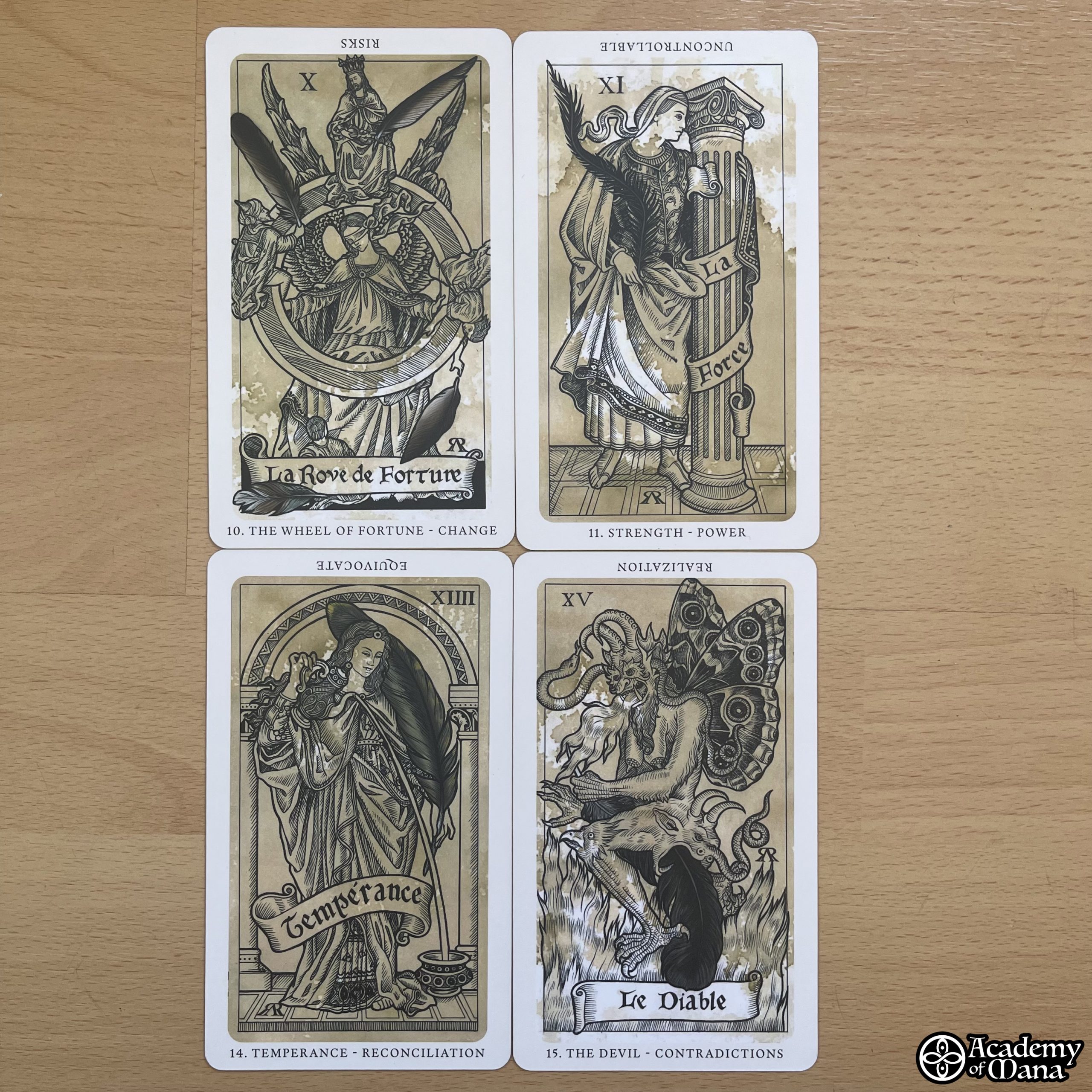
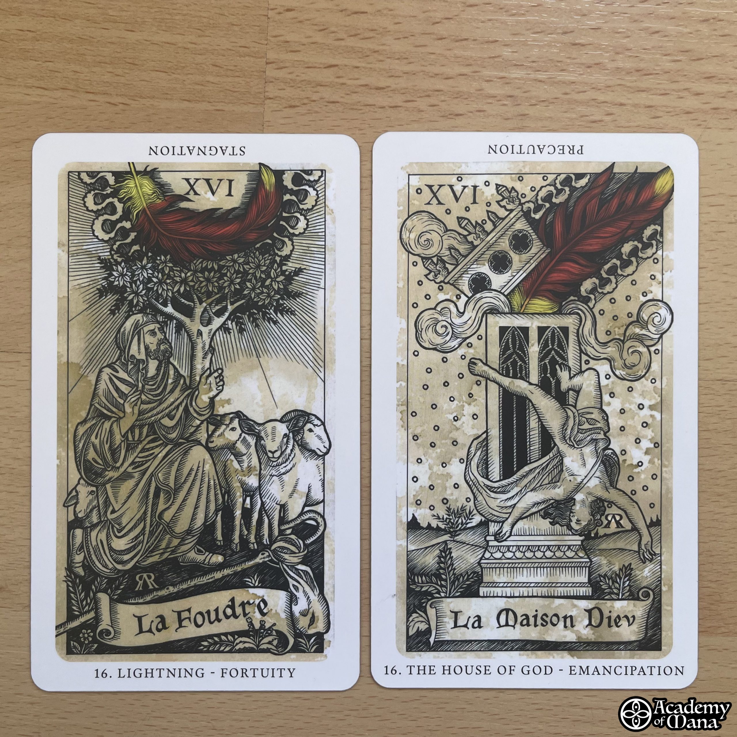
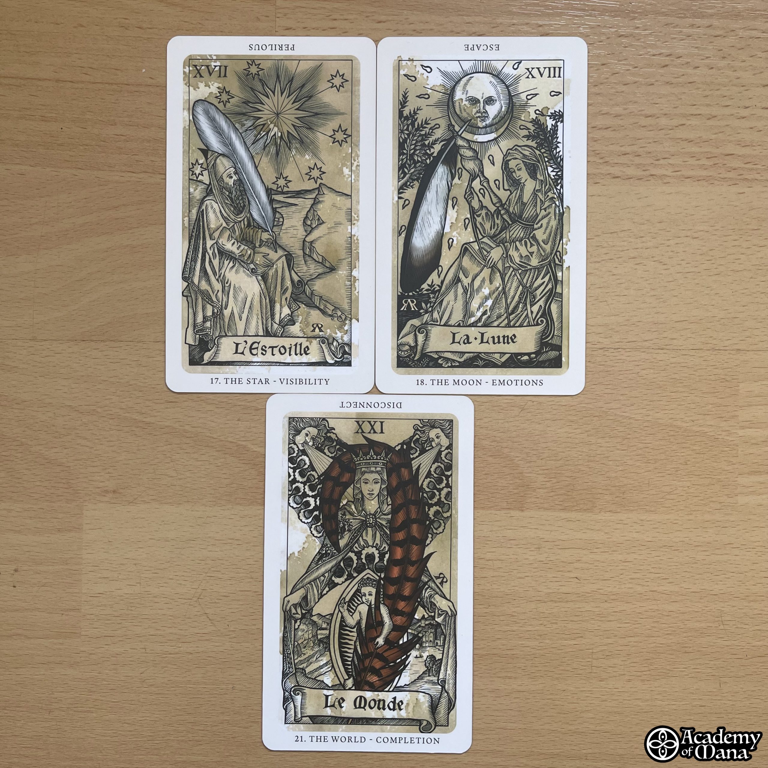
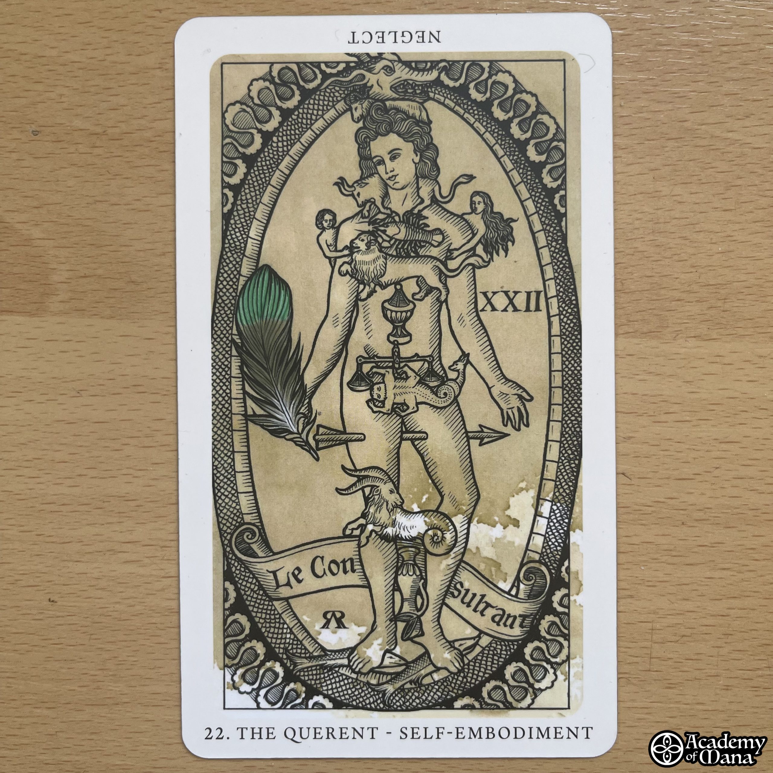
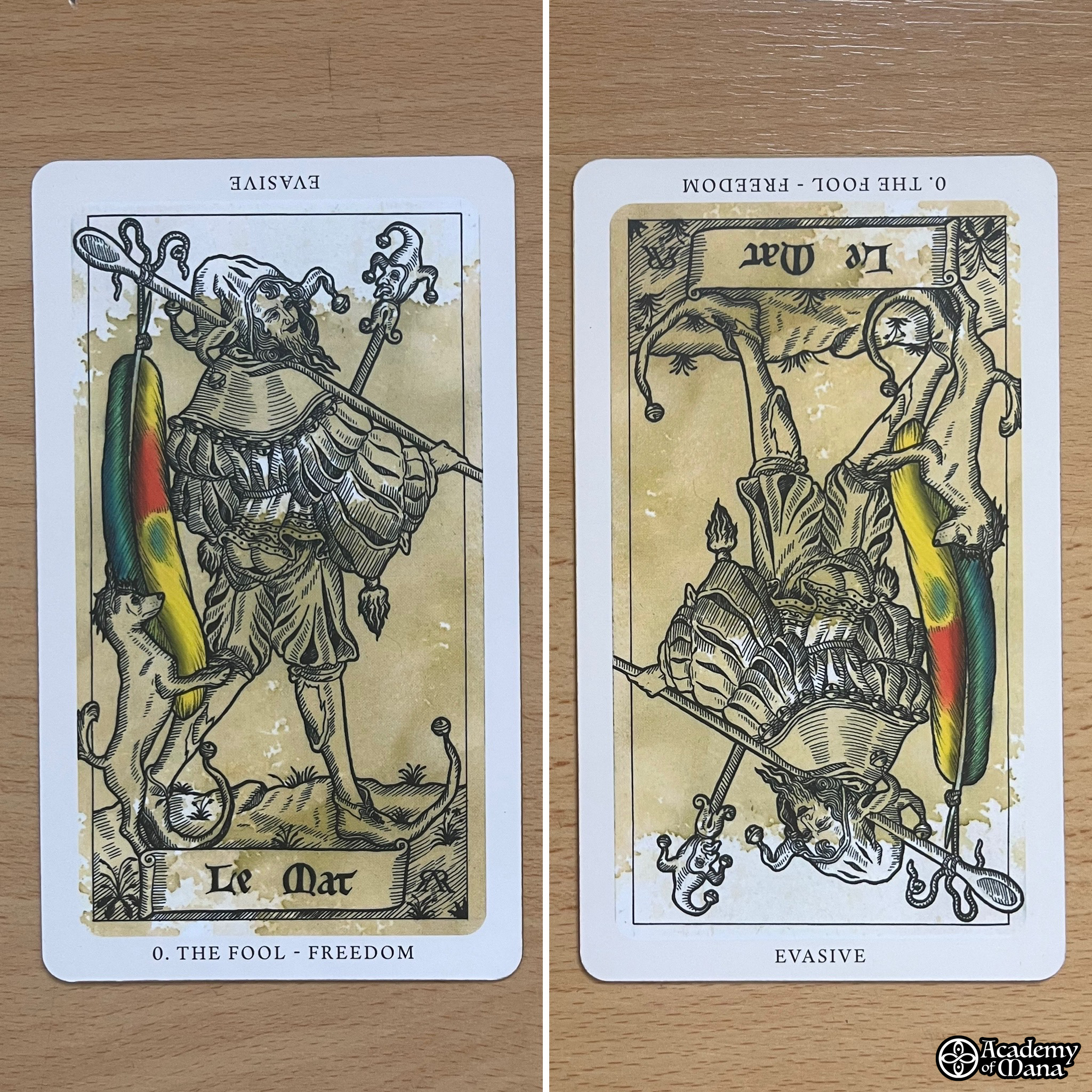
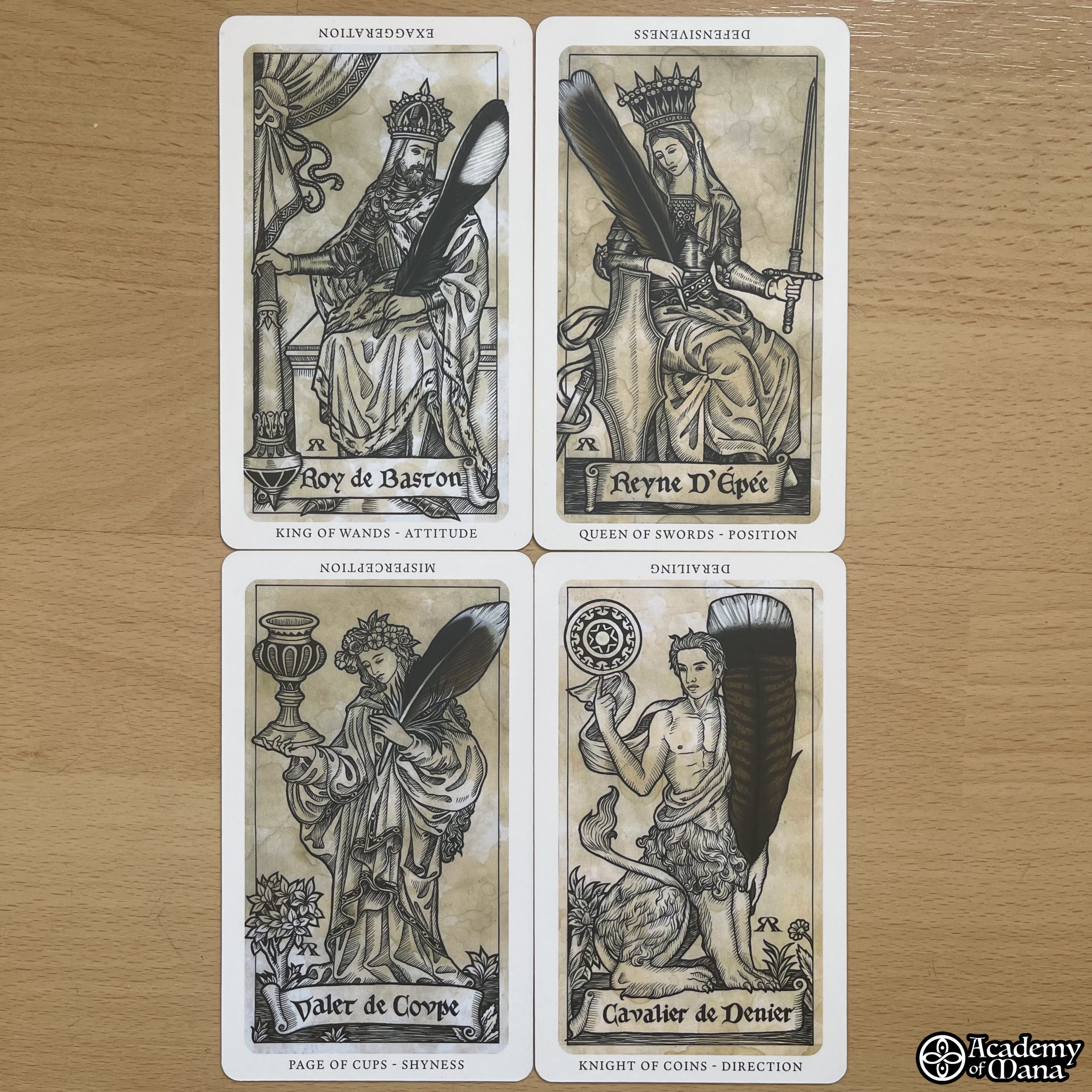
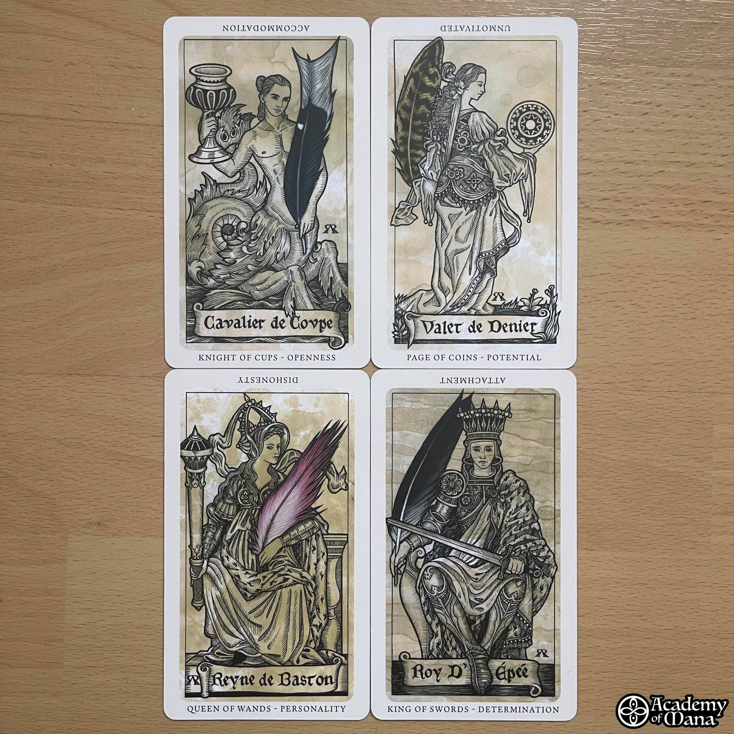
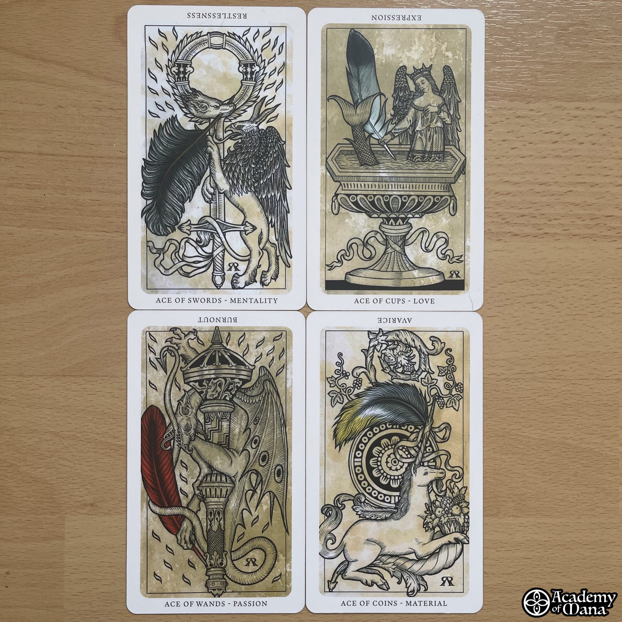
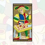
Moreover, there are some notably original features. Firstly, it’s clear that the artist was inspired by the most mythical of ancient tarot decks, replicating well-known iconographies such as that of Strength with its column, for instance (and THANK YOU A THOUSAND TIMES for keeping Justice as card VIII and Strength as XI! I’m so tired of creators who continue to perpetuate the absurd inversion of these two cards!). Also noteworthy are The Star and The Moon, which similarly depart from the Marseilles canon to reconnect with older roots. It’s magnificent! And an important note: Arcana XVI exists in two versions: The Tower and Lightning (inspired by Vieville). Additionally, there’s a 22nd card representing the querent, which, while not essential, is very lovely and will resonate with astrologers familiar with old zodiac-medical engravings.
However, I’m more reserved about three aspects: the size, the cardstock thickness, and the card finish.
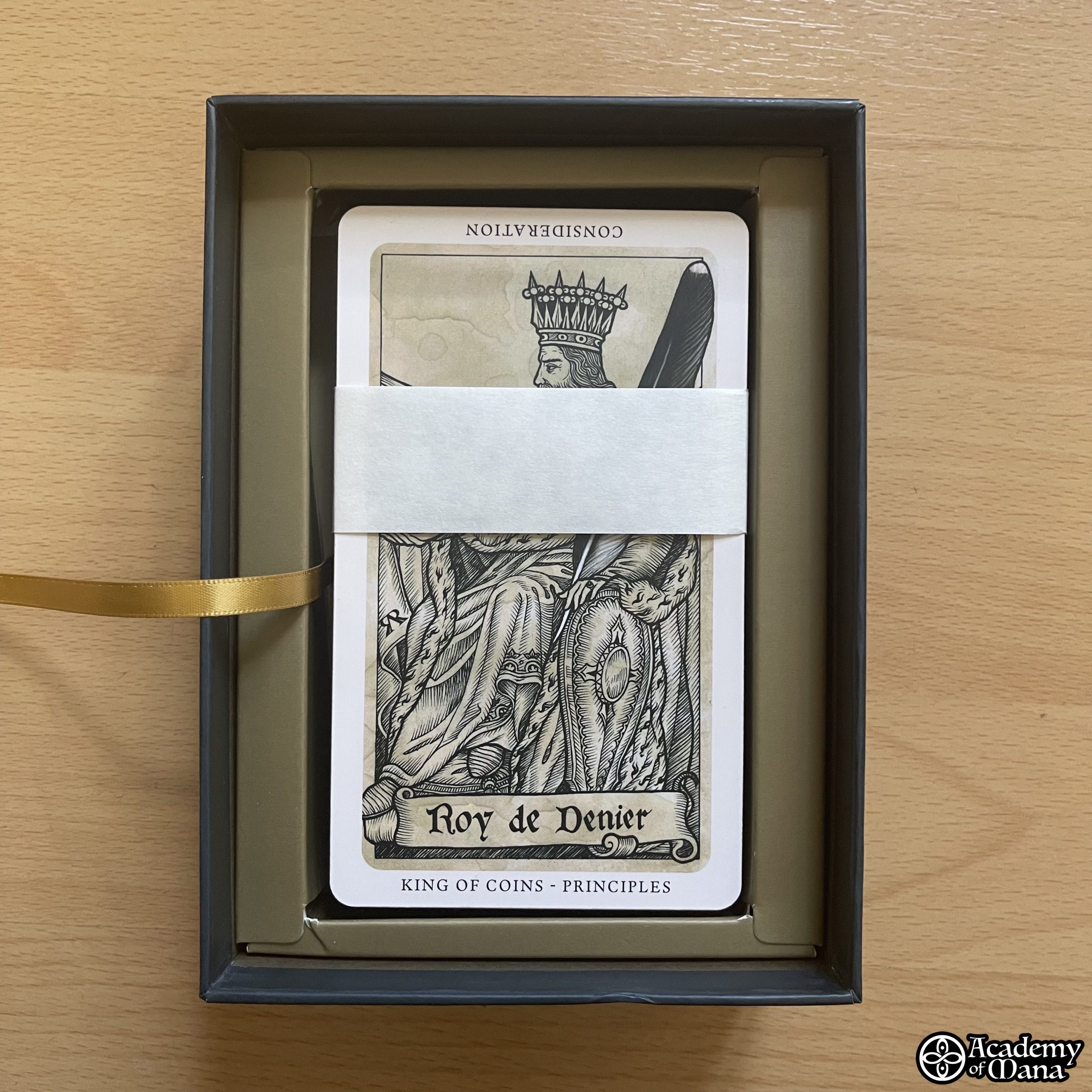
The size: although current trends lean towards either tiny or oversized cards, these cards are closer to standard playing card sizes, except they are slightly larger due to the borders. Each card has a white border featuring the card number, its name in English, and a keyword. I find this extra space unfortunate, particularly because the white border somewhat detracts from the immersive, parchment-like feel of the illustrations. I would have loved a borderless version!
Next, the cardstock feels a bit thin. The cards bend easily. As someone who adores the sturdiness of Paul Marteau’s Tarot de Marseille, I struggle to find satisfaction in today’s market, where cost-cutting often compromises card thickness to reduce expenses and increase profit margins. A real pity.
Finally, the cards have a “satin” finish, which makes them matte and offers good protection, but it also makes shuffling difficult (especially given their size, by the way…).
👋 THE HANDLING
The game is intended to be used in both upright and reversed readings. For those familiar with my approach to tarot practice, I believe this is unnecessary. The Mona Lisa remains the Mona Lisa even if hung upside down. It does not become the painting of Sali-Namo, the grocer from my neighborhood who has a pickle phobia, you see? Yet, this is sometimes what you read from certain authors. Here, that will not be the case. Reversed cards do not become inherently negative. On the contrary, the booklet includes interpretations similar to those I teach in my classes when I explain that each card represents a theme, a subject, and that the way to approach it—pleasantly or unpleasantly, positively or negatively, unofficially or officially, coming from oneself or from others, constructively or destructively, externalized or internalized, willingly or imposed—will be defined by the card’s orientation, upright or reversed. Whether the Hermit is upright or reversed, it always speaks of the same subject: distance. But if upright, it will refer to voluntary detachment, while reversed it may indicate escapism and misanthropy. It’s simple, yet effective.
However, I initially had some difficulty interpreting the cards during my first readings, but this was my own doing. A great lover of the Tarot de Marseille, practicing it for over 30 years and having written extensively about it, I sometimes struggle to break free from the interpretative habits I’ve developed for it. Here, trying to transpose them to the Medieval Feathers Tarot does not work. One is then forced to pause, exercise patience, listen to what the deck has to tell us, observe the cards it presents, and perhaps listen to what Jay R. Rivera, the author of the booklet, can narrate to us, to understand the message the deck conveys. It then becomes nothing but pure pleasure.
🎭 CONCLUSION
Let’s say it outright: this is a magnificent, effective game, a sumptuous work of art that will delight both the collector and the inspired seer. However, in my opinion, it is not a game suitable for beginners. To elaborate further, I would say that the logic learned through “tarological” practice alone is not enough; one needs to develop “taromantic” sensitivities to fully grasp its essence. Therefore, I absolutely do not recommend this game as a first deck for a beginner looking to get started. But it’s a gem that will appeal to everyone else, including those who enjoy being carried away by the energy and ambiance of the drawn cards. Bravo!
✓ WHAT WE LIKE
-
The originality of the concept
-
The beauty of the illustrations
-
The “French Touch” in the names of the cards and arcana families
✗ WHAT WE LIKE LESS
-
The satin finish of the cards that makes them slightly adhesive
-
The card stock is too thin
-
The booklet lacks sample readings